

The interface is a promise
Every screen makes a claim about what the system will do next. Most product bugs are broken promises between layers.
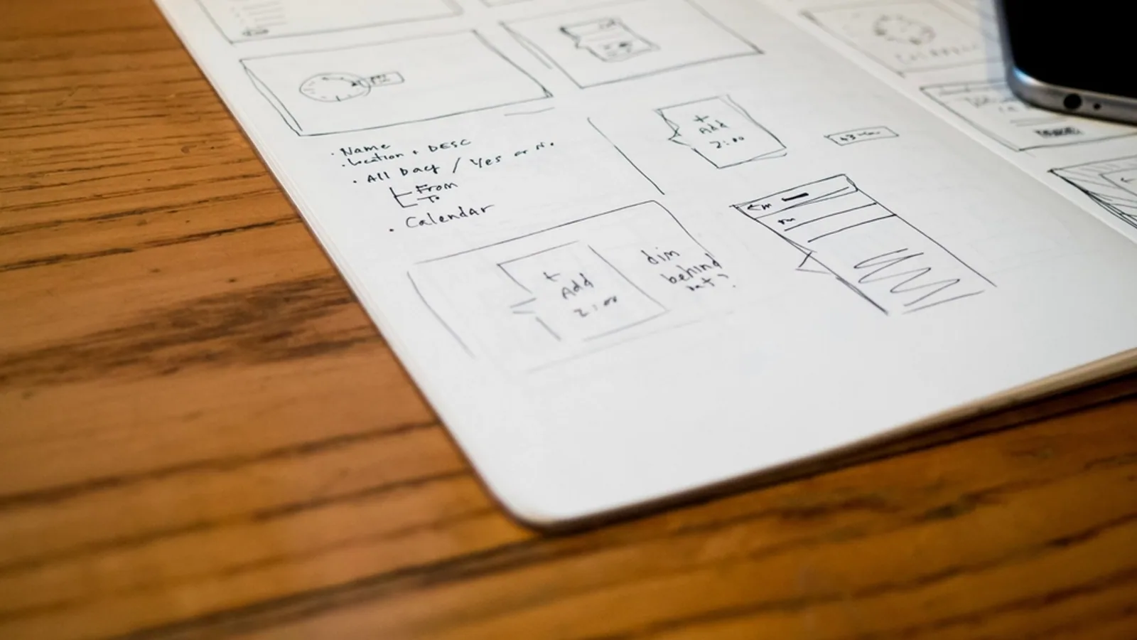
A button is a promise. A spinner is a promise with a deadline. A green checkmark is a promise that the server has already agreed. When those promises disagree with the state underneath, users do not experience a “bug” — they experience a system that lied to them, and they stop trusting the whole product.
This is why I keep interface work and systems work in the same room. The design language and the state machine are two descriptions of one contract. If the interface can say something the data model cannot prove, the interface is wrong, no matter how beautiful it looks.
Design the states, not the screen
The polished mockup usually shows the best state: data loaded, permissions correct, network healthy, balance positive. Real products spend most of their life in the other states. What does the screen say while the request is in flight? What does it say when the request succeeded but the confirmation failed? What does it say when the user has permission to view but not to act?
Name the state before you style it.
Give every optimistic update an honest rollback.
Never let a disabled control be the only explanation.
Make the empty state teach the next action.
A system that handles those questions feels calm. Not because it is simple, but because it is not pretending. Calm is a design outcome produced by engineering discipline.
Latency is part of the copy
A 400ms transition and a 4s wait are different products, even if the final screen is identical. Perceived performance belongs in the design review alongside typography. Skeleton screens, optimistic updates, and honest progress are not decorations; they are the copy the system writes while it works.
The test I use is simple: if I removed every animation and label, would the user still understand what the system is doing? If not, the motion is covering for a missing state. Animation should clarify a promise, not replace it.